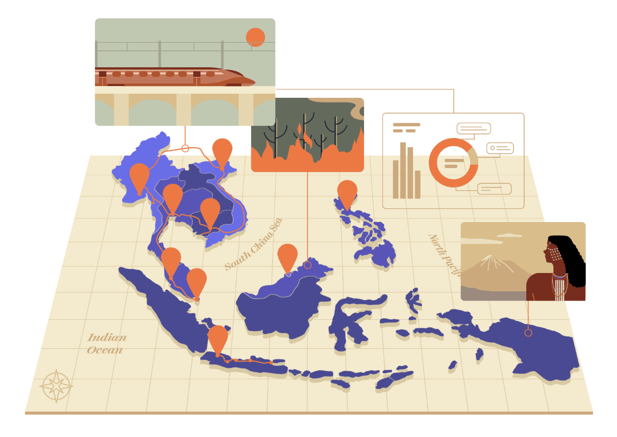
This post first appeared in Kontinentalist’s newsletter, Notes from the Equator. Kontinentalist, a Potato company, monitors Asia’s latest developments and uses maps to tell compelling stories. A map is one of the data visualisations that needs no introduction. Maps have existed for a long time, and they are now integrated into our daily lives in […]
Tag Archives: Kontinentalist
Coding a Kontinentalist Story

In my eight months of working with Kontinentalist as a front-end web developer, I’ve worked on five hard-coded stories and a handful of auxiliary data vis for other normal scroll stories. This roughly equates to one and a half months of work to produce a hard-coded story from conception to end. For that reason, I’ve […]
How I write data-driven stories

I’ve been a writer for almost two years now at Kontinentalist, a data-driven editorial studio in Singapore. In that time, I’ve interviewed my fair share of prospective interns, writers, and editors. Almost always, when asked why they’re interested in the position, our interviewees answer something along the lines of, “to learn how Kontinentalist merges data […]